Color on a website is like the salt or sugar in dish, it forms the essence of website designing. In order to use color effectively one has to develop a clear understanding of the essential characteristics.
Every color has certain visual, emotional and psychological impact. Broadening our understanding of knowledge of color wheel helps us classify colors and choose the right combination. The color wheel is basically a circle comprising of primary, secondary or tertiary colors will facilitate proper color usage.
Every color in the color wheel has the ability to evoke varying emotions. So much so feelings are often associated with colors like “feeling blue” or “red with anger”. This is because each one of them has a special unique look and feel and is different from the other. All colors in the wheel are referred to as “true or simple colors. So when a viewer looks at your website, he or she responds to the color created when his or her brain draws sense on the basis of the light signals it receives externally. Simply put the colors are all in the brain. Hence the physical and psychological response to color and this is why its imperative to set the right mood using the right design and color.
Communicating well enough with your target audience is all about choosing the right color to convey the right meaning. It is not a matter of preference that but more of what is going to be more likeable. The color wheel is an important that empowers visibility and has the ability to sustain that visibility. Controlling color and designing is about making smart choices that reinforce what website business objective.
Colors are generally associated with some vital signs or emotions and they might differ from place to place. So part of understanding of what your target audience really wants, is also understanding how they relate to colors. Some may be culturally important and have a specific symbolic relevance.
Color wheel is formed of two distinct types of colors; warm and cool colors.
Warm Colors

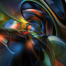
Warm colors include red, orange and yellow as these display warmth and energy and catch a viewers attention pretty easily.
Cool Colors
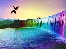
Cool colors include blue, green and violet and are often used to describe feelings of serenity, trust, business value or quiet emotions of sadness.
Both warm and cool colors can though drawn attention or bounce attention depending on website design usage.
Visually though as a designed the aim should always be to positively impact viewers through your designs. Use of colors that dont blend well with one another or an overspill of colors, perhaps underplay of colors can drive people away from your website. Let alone give them the opportunity to have a look at your content. So an ideal way to increase visibility would be to plan the impression you want people to have and then choose colors. The key is being consistent in your color scheme throughout your design.
Choose, Blend and Design
The color wheel can be used to generate attention, convey relevance and give a visual appeal to your website. Visual hierarchy in design must be developed carefully and in a calculative manner to acquire the right effect. Contrasting colors are attention grabbers. Repetitiveness is useful when providing visual cues to people about related or interconnected information. Your color wheel can be a game changer as far as your website visibility is concerned so building a relationship between the colorful elements of design usually helps. Well chosen warm and cool colors will produce the perfect mix and give the depth and meaning your website requires and increase visibility.